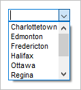
ucombobox (Combo Box)
The ucombobox widget combines an input field with a drop-down list. It allows users to select one item from a previously defined list,
or enter their own data instead. It is applicable only to form components. Uniface provides a logical widget called ComboBox, which is mapped to ucombobox.

For more information, see Specifying a Widget for a Field or Entity.
| Logical widget name: | ComboBox |
| Maps to physical widget: |
|
| Default definition: | ComboBox=ucombobox(font=listfont;dimmedbackcolor=off;autoselect=on)
|
| Use for: | String fields with ValRep list. |
| Supported triggers: | trigger valueChanged |
| Supported properties: | See Widget Properties |
Supported in egrid(Grid) widget? |
Yes. Some properties may not be
applicable. For more information, see egrid (Grid) and Widgets and Properties Supported in Grid Widget. |
| Supports MSAA? : | Yes, for testing purposes only. For more information, see Accessibility. |
Description
A combo box is similar to an editable drop-down list. It consists of an edit box together with a selection list of predefined items. The list appears when the user clicks a button to the right of the editable section.
If the Insert Mode
property is set to Unique or Always, any value entered by the
user is added to the drop-down list. This is only in effect for the lifetime of the widget instance. If you
require more permanent storage of user entries, use ProcScript to do this.
Uniface sets the field to the value associated with the selected item and activates the valueChanged trigger for that field. This is the only trigger that can be activated by a combo box is the valueChanged trigger.
This widget is not available in character mode. It is mapped to a text field.
Note: The values specified for a field with a ucombobox are limited to 255 characters. If the value is greater than this, the field becomes read-only.
ValRep Handling
Unlike the DropDown and ListBox widgets, the ComboBox only displays values. If the ValRep list assigned to the field contains Representations, these are ignored.
For more information, see ValRep
Widget Properties
|
Property |
Technical Name |
Dynamic? |
|---|---|---|
|
3D |
No |
|
|
Attach |
Yes |
|
|
AutoSelect |
Yes |
|
|
BackColor |
Yes |
|
|
DimmedBackColor |
Yes |
|
|
BottomLine |
Yes |
|
|
DrawOutside |
No |
|
|
Entries |
Yes |
|
|
ForceFit |
No |
|
|
ForeColor |
Yes |
|
|
Frame |
No |
|
|
Insert |
No |
|
|
LabelFont |
Yes |
|
|
ShowEllipsis |
No |
|
|
Sort |
No |
|
|
Value |
— Not mapped to a widget property, but is handled in the same way as a ValRep list. |
— |
|
Font |
Yes |
|
|
|
Yes |
|
|
DblClk |
Yes |
|
|
|
Yes |
Note: The Frame and 3-D Effect properties are only supported on 16-bit Windows platforms.
