Using the Grid Widget
Use the grid widget to display multiple occurrences in a tabular format.
The grid widget is an entity-level widget. Although it is possible to set the default Widget Type when creating the application model, it is more common to set the Widget Type when defining the component entity.
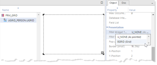
- Draw the entity on the form canvas to the size that you want the grid to occupy.
- Edit the component entity properties and set
the FRM Widget Type to
Grid.
Tip: If you have an existing form that you want to convert to use a grid widget, changing the widget type of a component entity automatically changes the entity to a grid in the layout. Note that some widgets are not supported in the grid. For more information, see Widgets and Properties Supported in Grid Widget.
-
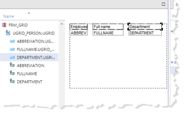
Add the fields you want to use into the entity, then add the labels above each field.
See Define Labels and Text in Forms and Reports.
The labels are required if you want the grid widget to display column headings.

-
To make the appearance in the layout editor
more closely reflect the runtime appearance, arrange the sequence and size of fields as
desired.
At runtime, users can resize the columns so this is just for the default size.
-
For layout management in a resizable form,
you can use split bars to define the fixed areas of the form and the Attach to
Window grid widget properties to control in which directions a grid widget can be
resized.
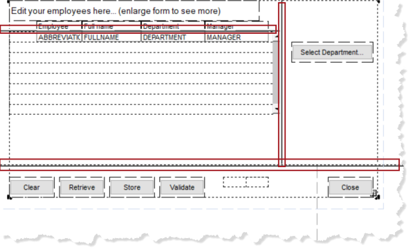
For example, the following layout uses four split bars, with the properties set to Locked and Attach to the Top, Bottom, Right, and Right respectively. The Attach to Window grid widget properties are also set to Top, Bottom, and Right.

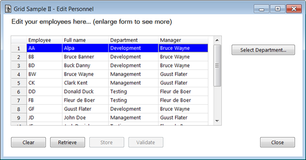
When the component is resized at runtime, the areas at the top, bottom, and right of the form remain a constant size, but the size of the grid changes as the size of the form size changes. By setting the Style property of the split bars to Hidden, you can make this behavior complete transparent to the user.
Runtime Grid With Hidden Split Bars
-
If you want to enable sorting by clicking
column or row headings, program the extended triggers
ColumnHeader_LClickedandRowHeader_LClicked.For example:
trigger ColumnHeader_LClicked params string fieldName: in numeric shiftKey: in endparams ; clear the selected occurrences call clearOccurrenceSelection("<$entname>.<$modelname>") ; Clear any first selected occurrence $firstSelectedOccurrence$ = 0 ; sort occurrences based on the clicked column if ($sortOrder$ = "%%fieldName%%%:a") $sortOrder$ = "%%fieldName%%%:d" else $sortOrder$ = "%%fieldName%%%:a" endif sort/e "<$entName>", $sortOrder$ $prompt = fieldName end ; trigger ColumnHeader_LClicked -
If you want to have automatically resize
columns proportionally when the width of a column or the entire grid is changed, you can use the
extended triggers
Column_ResizedorViewport_Resized.These triggers give enable you to completely control how the columns are resized. For example, when the grid widget is resized, a product number column may need to remain a fixed size while the width of the comments field needs to be changed.