Mobile App Layout
Each mobile platform has its own user interface and interaction conventions, which affect the layout of a mobile application. The Mobile App Layout is a framework that maps HTML elements in a DSP layout to generic layout definitions.
Uniface uses these layout definitions to render the DSP appropriately for the device (phone or tablet), operating system (Apple or Android) and toolkit (web or native-OS). The Mobile App Layout ensures that Uniface can make the DSP adhere to platform standards on the different devices, scroll the content as the user scrolls down, and add standard controls such as Back and Close buttons.
Uniface recognizes the following definitions in a Mobile App Layout:
Header
A Header defines content that is displayed at the top of the page and which remains visible, even if data in the Content area is scrolled. Depending on the platform, it may contain navigation buttons such as Back and Close, or action buttons such as a Menu control or Share tool, as well as the title of the app.
Content
The Content defines a central area in which the main data is displayed. It takes up the majority of the space, between the Header and the Footer.
Footer
The Footer is an optional element in a mobile layout, but can be used to provide extra navigation, menu, or action options.
As a Uniface developer, you are free to put any content you like into a Header or Footer. You can also have multiple headers and footers.
To bind your content to the mobile layout definitions, you can use the data-uniface-role attribute. To style these definitions, you can define styles for the Uniface classes that are automatically applied to Mobile App Layout elements.
Binding a DSP to a Mobile App Layout
To implement a mobile app layout, you need to bind HTML elements in the layout of a main DSP (that is, not to a DSP in a DspContainer) to Mobile App Layout definitions. To do so:
- Edit the source code of the DSP layout.
- For each element that you want to define as a
mobile app area, apply the data-uniface-role attribute using the appropriate
value:
data-uniface-role="header"data-uniface-role= "content"data-uniface-role="footer"
For example:
<html>
 <body>
   <div data-uniface-role="footer"  id="ufld:FOOTER.NME.NM">DspContainer</div>
   <div data-uniface-role="header" id="ufld:HEADER.NME.NM">DspContainer</div>
   <div data-uniface-role="content" id="ufld:BODY.NME.NM">DspContainer</div>
   <p data-uniface-role="header"> This is a Footer that is not a direct
     child of the HTML body element.</p>
   <div>
     <p data-uniface-role="footer">
      This text is added to the Content,
      even though it is tagged as a footer.
     </p>
   </div>
 </body>
</html>
Note the following:
- Elements bound to the mobile app layout must
be direct child elements of the
<body>HTML element. If this is not the case, the bound element is added to the Content. - You can define multiple HTML elements as the same type of Mobile App Layout definition. For example, you can have multiple Header elements or multiple Content elements. In the generated XHTML page, elements of the same type are grouped together and displayed at the appropriate locations in the layout.
- Any element that does not have the data-uniface-role attribute is assumed to be part of the Content.
Example: Basic Mobile App Layout
A Mobile App Layout is typically implemented as a DSP that contains several DspContainer fields. These can contain pre-defined DSPs for various platforms, or your own custom DSPs. The HTML elements bound to the DspContainer fields are also bound to Mobile App Layout elements using the data-uniface-role. This enables Uniface to group the elements together and generate HTML that renders correctly.

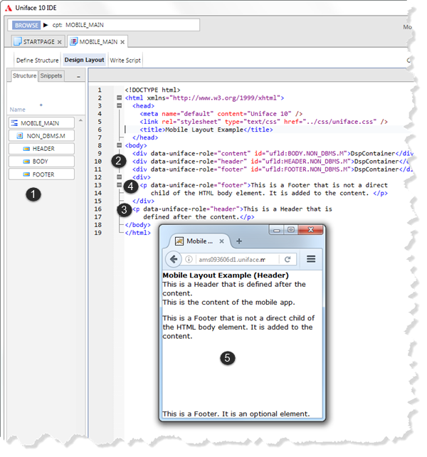
- The component structure defines three DspContainer fields: HEADER, CONTENT, and FOOTER.
- The component layout contains
<div>elements that are bound to these fields. Notice that the order of the fields in the layout is not the same as the order of fields in the component structure. - A
<p>element is not bound to the component structure but it is tagged asdata-uniface-role="header". There are therefore two HTML elements bound to the Header. - A
<p>element inside an unbound<div>is tagged as a Footer. - When compiled and displayed in the browser,
notice that the Header contents have been grouped together at the top of the page, and the Footer
element is positioned at the bottom. The second Footer element is added to the Content, not the
Footer, because it is not the direct child of the
<body>element
Styling Mobile App Layouts
The layout of a mobile app is styled using CSS.
Uniface automatically applies its own HTML class values to the Header, Content,
and Footer in the generated layout:
class="-uf-header"class="-uf-content"class="-uf-footer"
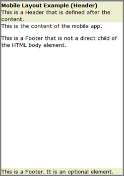
By defining your own styles for these classes, you can customize the appearance of all Header, Content, and Footer elements. For example, the following style definition applies a light tan background to the Header and Footer:
<style>
.-uf-header, .-uf-footer {
    background-color: #EEEED1;
}
</style>

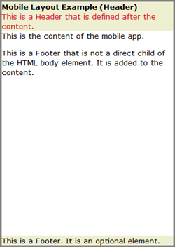
You can also define your own classes and apply them in the DSP layout, thereby overriding or enhancing the style. For example:
- Add your own custom style (in this case
.red) - Add the HTML class attribute to elements that
should have the
.redstyle. In this case, it's added to the second header element.
<style>.red {
   color: #D90E1A;
}
.-uf-header, .-uf-footer {
  background-color: #EEEED1;
}
</style>
 <body>
...
    <p data-uniface-role="header" class="red">  This is another Header element.</p>
...
</body>

