Popup Forms
Popup forms are displayed as secondary windows that are anchored to a field, although their position is completely configurable. They can be used in situations where you want to display or gather a limited amount of data, for example, in a ribbon bar or super tooltip.
Note: Popup forms are not supported in the grid widget.
Any form component can be defined as a popup form by
setting its Window Type property to Popup, either in the
Window Properties dialog box, or when creating the form instance in
ProcScript.
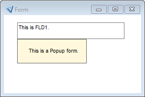
Popup forms are anchored to a field. Typically, the detail trigger of the field can be used to activate the popup form. By default, the popup form is displayed below the field, starting from the bottom left corner.
However, you can configure a popup form to be displayed starting from any corner using the Position window property. This property defines a position relative to the widget boundaries, or to a popup rectangle that is defined for the widget.
The PopupRect widget property defines a rectangle that can be used as anchor point for the popup window instead of the widget boundaries. It is especially useful for large widgets, such as the HTML widget, where you want the popup form to be displayed somewhere within the widget boundaries. However, the rectangle for the popup window can also be placed outside the widget or even outside the application window.
If the position of the popup form is too close to the boundaries of the screen for it to be displayed as configured, its position is reversed.
When the parent field or rectangle of a popup form is moved, the popup form moves with it. However, a popup form with a title bar does not move with its parent field.
