Working with Panels
Panels are global objects that are used to define toolbars or floating palettes in desktop applications. They can be associated with a form component or an application shell.
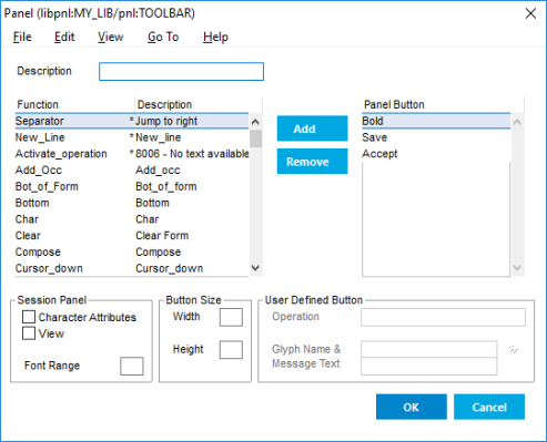
Each button in a panel can activate an operation or structure editor function. Operation buttons can only be used in form panels. Panels can also contain separators and multiple lines.
- Choose .
-
In the Open Panel
dialog, select the library to hold the panel, and select an existing panel to edit or enter a new
name to create a new panel.
This opens the panel in the panel editor (Define Panel).
- To create a new panel or open another panel for editing, choose New or Open in the File menu.
-
To add a button that invokes a structure
editor functions, select it in the Function list and click
Add.
This automatically sets the Glyph & Message Text property, which provides the icon and tooltip.
Tip: It is recommended that you define fewer than ten functions in a panel.
-
To add an operation button to a form panel:
-
Select
Activate Operationfrom the Function list. -
In the Operation property, specify
the name of an operation defined in the component's Operations container.
If an operation button refers to an operation that does not exist in its current context, the button is disabled.
Note: Operation buttons are not displayed if the panel is used as a pop-up panel.
-
In the Glyph & Message Text
property, click >> and select the glyph you want to use for the operation button.
If a message of the same name exists, it is automatically associated with the glyph.
Note: If you have not yet defined a glyph and tooltip message for the button, you can open the Glyph and Message editors from the Go To menu.
-
Select
- If the panel is to be used as a session panel, set the following properties:
-
To save (and compile) the panel, choose
.
Alternatively, click OK to save the panel and close the editor.
- To delete the panel, choose .
-
To use a panel in a form or application
shell:
- In a Form component, specify the panel in the Panel property.
-
In a Windows or character-based application shell,
specify a pop-up panel in the Panel property and a session panel in the
Session Panel property.
Only a Windows application shell can have more than one panel assigned.
- Set the Panel Position to determine where the form or session panel is displayed.
-
To control the appearance of the panels in
Windows applications, edit the following settings in the application initialization file
(usys.ini).
For example, to define your own color scheme:
-
Set
ButtonStyle=9(User-defined) - Set the color properties using the Panel setting in the [application] section.
(For readability, this example is formatted over several lines)
;usys.ini [application] Panel = upanel(backcolor=#fdfdfd;forecolor=black;forecolorselect=green; backcolorselect=#c0ddfc;bordercolorselect=#3399ff; backcolorfill=gradient) [upi] ButtonStyle=9 -
Set
Tip: If the panel is not displayed during testing or deployment, ensure that the assignment file contains a $VARIATION setting that specifies the library that contains the panel.
