DatePicker
The DatePicker DSP widget enables the user to select a date from a date control, such as a calendar.
| Logical widget name: | DatePicker |
| Maps to physical widget: | htmlinput of type text |
| Default definition: | DatePicker=htmlinput(html:type=date)
|
| Supported triggers and properties: | See htmlinput. |
| Use for: | Fields of Uniface data types Date, Time, and DateTime. |
Description
By default, the DatePicker widget is mapped to the
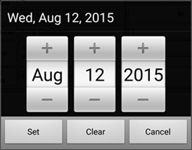
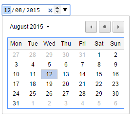
HTML date input control (<input type="date">). Its appearance depends on the
browser and operating system. Browsers that support this type will display a native date picker
when the user tries to enter a date.
Date Picker on Android Phone

Date Picker in Chrome on Windows

For fields with Uniface data type Date, it is possible to use the Datepicker widget for user input. However, if a browser does not support the
Datepicker, an HTML text input control is used instead.
When a text input control is used, NLS display formats are applied but a locale is applied only if a value has been set using $webinfo("Locale"). If this has not been set or the value is not recognized, the locale defaults to "en", meaning that only English text is displayed in formats that call for text. For more information, see Display Formats for Date and Time in Dynamic Server Pages and $webinfo("Locale").
Depending on the browser, the OnChange trigger may be fired more than once for the Datepicker widget or other native HTML5 controls for Time, Datetime-Local, Week, Month, and so on. For more information, see webtrigger OnChange.
Widget Property Restrictions
The following restrictions apply:
- For the Text Alignment
(
style:text-align) property, the valuejustifyis not supported.
