UnifaceButton
The UnifaceButton is a logical widget for a button that can be styled using colors and images. It supports properties that are not available for other command buttons.
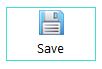
Examples of Uniface buttons

|
Logical widget name: |
UnifaceButton |
|
Maps to physical widget: |
ucmdbutton
|
| Default definition: |
|
| Supported triggers and properties: |
See ucmdbutton |
| Use for: |
Boilerplate or control fields (as defined by the Is Static and Is Control properties). |
Description
The distinguishing characteristic of a UnifaceButton is that the Representation property is set to Uniface. This makes it possible to set a variety of properties for colors, frames, images, and alignment, which are not available for Windows or Header buttons.
When the Representation
property is set to Uniface, you have greater control over the appearance of
the button. For example, you can:
- Control the alignment of the button text and image.
- Set background and foreground colors for the button, and change the color of the button text depending on the state.
- Display an image in the button, either with or without text.
- Completely replace the representation of the button with an image, and use different images depending on the button state.
Adding Images
You can use images in Uniface buttons in several ways.
- Specify the field's data type as Image, and the field's value to the image you want to use as the default. You can optionally use specify additional images for different button states (Focus, Hover, and Active).
- To add text to such a button, define an associated label and ensure that it is physically attached to the button field. This internalizes the label text in the button. For more information, see Internalized Labels.
- In a String field, you can specify an image and text as a Uniface list (for example
@image.png;Button Text)
Setting Properties in Proc
The following code sets the value and properties of a field to display a button with an image as well as text.
Note: The Data Type of FLD2
must be String, because the field's value contains a Uniface list that defines both an image and text.
operation exec variables string vProps endvariables FLD2="@save.png!Save"putitem/id vProps, "representation", "uniface"
putitem/id vProps, "imgsize", "IMG_large" putitem/id vProps, "ImageLabelAlign", "top" putitem/id vProps, "frametype","flat" putitem/id vProps, "framecolor","turquoise" $properties(FLD2) = vProps
edit end
- Assign both an image and text as the field value by defining a list with GOLD ! (exclamation mark) as the separator.
- Create a list of widget properties that define
the size and alignment of the image, and the frame type and color. The
Representation property must be set to
unifacewhen images are used. - Assign the properties to the command button.