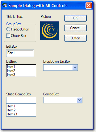
BlueZone Dialog Editor controls
Dialogs created using BlueZone Dialog Editor can have one or more of the following standard Windows Controls. Refer to Figure 1 to see what each control looks like.
- Group box
- An outlined box used to label controls with related functions.
- Button
- A button control that sends sets a value when pressed.
- Text
- Static text used to label dialog controls.
- Edit box
- A control that accepts text typed by the user.
- Check box
- A control that uses a check mark to indicate the on or "true" value and blank to indicate off or "false" value.
- Radio button
- A control used in a group of two or more used to force the selection of one item in the group.
- List box
- A control containing a static list of items from which the user chooses.
- Drop-down box
- A control containing a list of items that display when the arrow is clicked, "dropping" the box.
- Static combo box
- A control that contains a static list of items from which to choose, but also allows the user to type in a value that is not in the list.
- Combo box
- A drop control that contains a static list of items from which to choose, but also allows the user type in a value that is not in the list. The selection list is displayed when the arrow is clicked, "dropping" the box.
- Picture
- Used to display a bitmap image on the dialog.
Figure 1. Sample dialog